
Pretzel Play
Early years online learning provider
Based in Northern Ireland, serving women throughout the UK.
A one-month social media campaign that established a consistent visual identity and used value-led, educational, and promotional content to build awareness of Pretzel Play's training courses whilst supporting sales.
Key Results
Consistent Visual Identity Established
Stronger Brand Recognition
The Challenge
Pretzel Play offered three training courses aimed at women interested in child development and play-based learning, but had no established visual branding for its social media content. The challenge was therefore twofold: to create a recognisable and consistent visual identity, while developing content that communicated the value of the different courses and supported course sales.
The Strategy
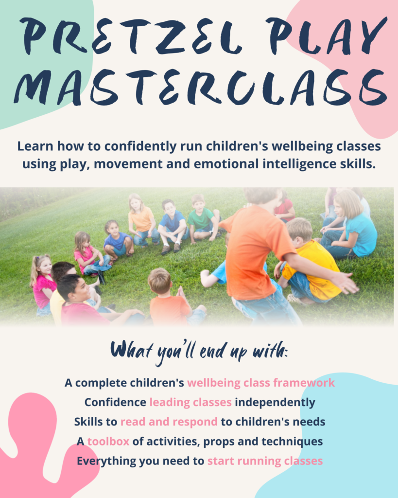
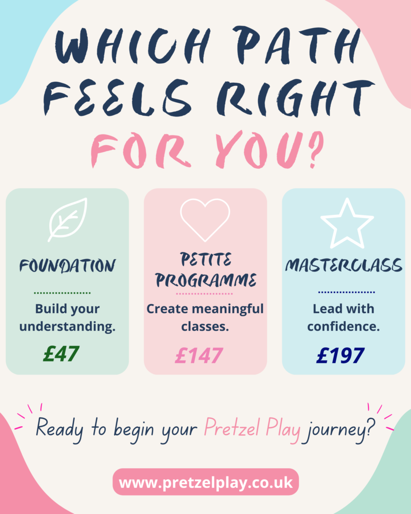
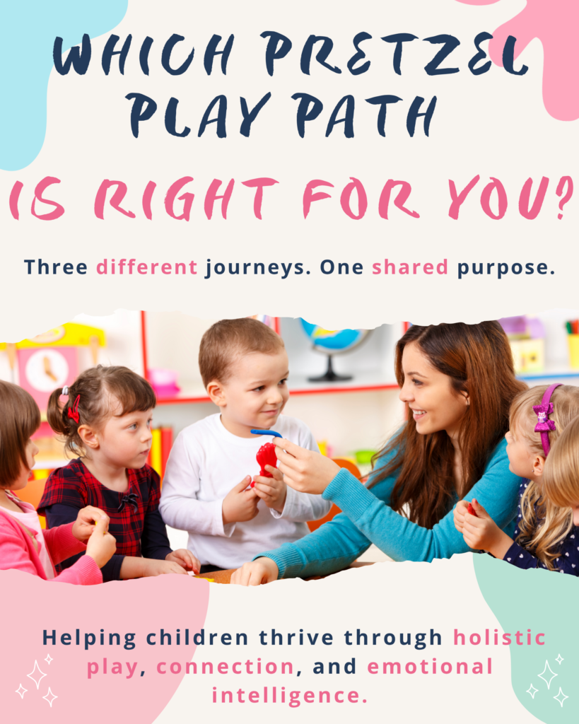
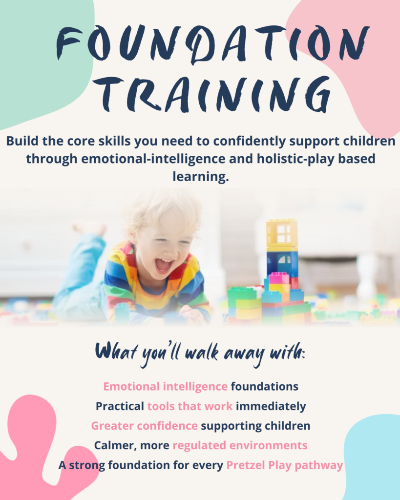
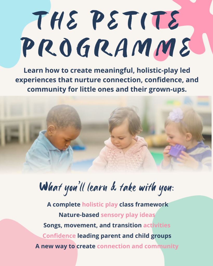
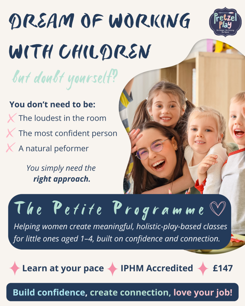
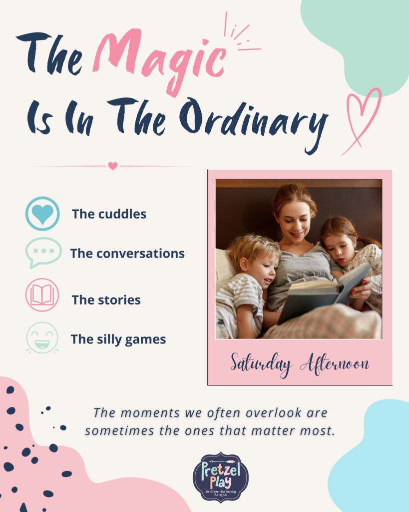
I developed a visual direction for Pretzel Play's social content, introducing a consistent colour palette, typography, graphic elements, and image style that complemented the existing logo and reflected the warm, playful nature of the brand.Alongside this, I developed a content strategy that built interest in the courses through value-led and educational content rather than relying solely on direct promotion. The Foundation course became the primary campaign focus, supported by content promoting the wider course offering.
The Execution
Over the one-month project, I created a cohesive suite of branded social assets and two Reels, establishing a consistent look and feel that could be carried across future content. I then applied this visual identity across a focused campaign for the Foundation course, alongside supporting content for Pretzel Play's other training options. Content moved between broader value-led topics, audience pain points, course education, benefits, and direct calls to action, giving the campaign a clear journey rather than treating every post as a standalone sales message.
The Results
Established a recognisable and consistent visual identity across all social content.
Increased brand recognition through repeated colours, typography, imagery, and graphic elements.
Improved audience understanding of Pretzel Play’s training courses and who they were for.
Delivered a cohesive campaign journey rather than isolated posts, improving overall content flow.
Provided Pretzel Play with a sustainable visual and content direction for future campaigns.

The brand had no established visual identity.

A cohesive, recognisable brand identity was established.